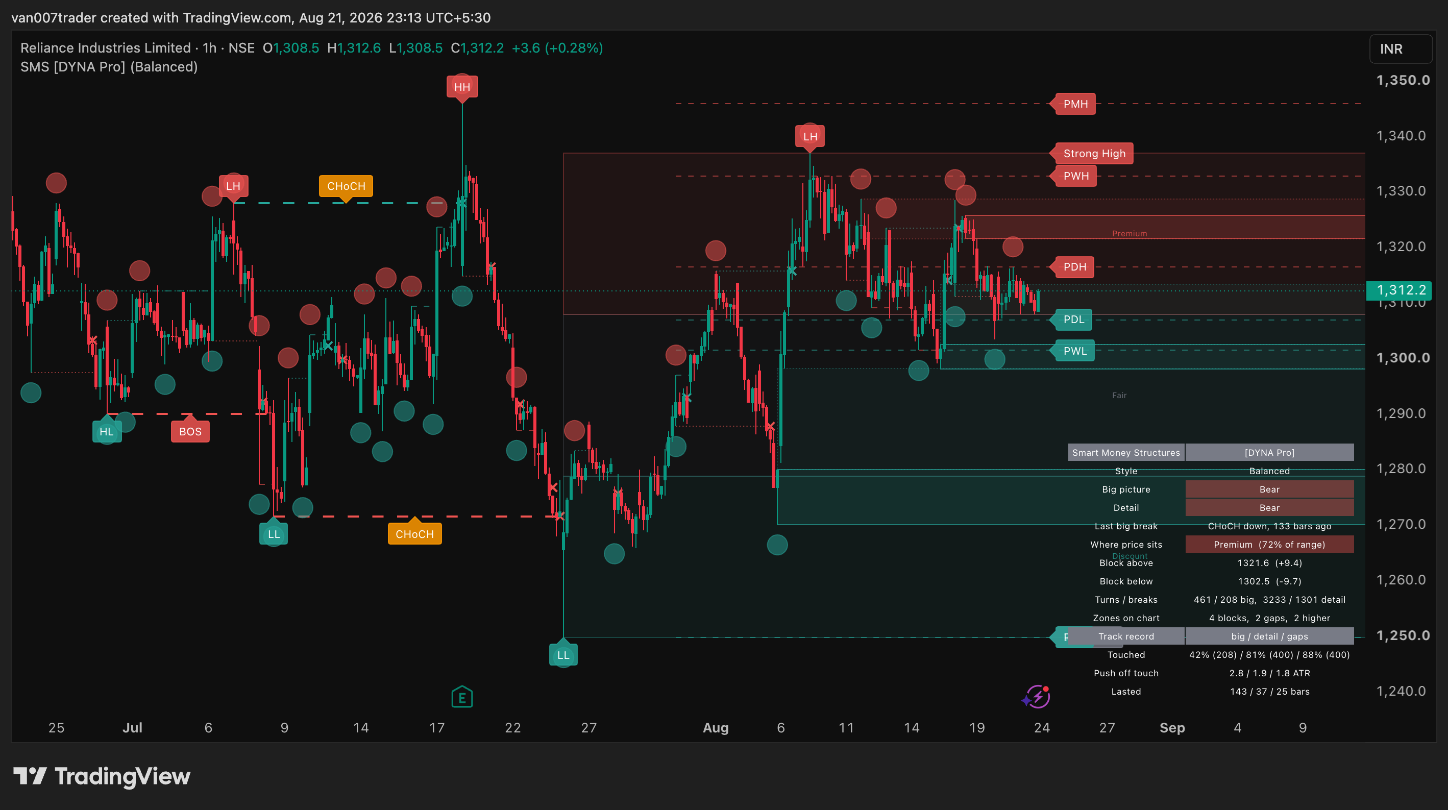
Smart Money Structures maps what price has already done, so you can stop guessing where the levels are. It finds the turning points that shape the trend, marks the moment one of them is broken, and leaves boxes on the candles that pushed price away — the places price tends to come back to.
It does not give entries. It is a map, not a signal service. What it gives you is a chart where the structure is already drawn: which way the market is leaning on two scales at once, where the untested zones sit above and below you, and whether the last break carried the trend on or turned it around.
Everything is built from closed candles. A mark appears once and never moves. The two higher timeframes it reads come from the last completed higher-timeframe bar, so a 60-minute block cannot appear early and quietly shift later.
Key Features
- Two structure streams at once — a big-picture stream and a detail stream, each with its own turns, breaks and bias
- BOS and CHoCH labelling, so you can see at a glance whether the trend continued or changed character
- Order blocks with a full lifecycle: fresh, touched, then gone when price closes past them or they age out
- Fair value gaps on the same lifecycle, filtered by size in ATR so tiny gaps do not clutter the chart
- Higher-timeframe blocks from two bigger timeframes, drawn hollow so they never look like a chart block, each tagged with its timeframe and direction, written inside the box on the edge price reaches first
- Equal highs and lows, plus premium and discount bands whose range follows price instead of freezing in a trend, and named strong and weak range ends
- Previous day, week and month high and low, plus the 52-week high and low, each hidden on a chart that is already that big
- A live panel: both biases, the last break, where price sits in the range, the nearest unbroken zone on each side, and running counts
- An in-chart track record: the panel reports how often the zones on your own chart were touched, how far price moved away from them afterwards, and how long they lasted, with the sample size beside every figure
- Three presets that grade chart noise, plus a Custom mode
- Ten built-in alerts and a webhook JSON layer for automation
How It Works
The turning-point engine does not use a fixed-lookback pivot. That is what most structure scripts use, and it is why their highs and lows arrive in clumps and in any order — two highs in a row, or a low that never had a high before it. This engine is built so that highs and lows always alternate, and so that a swing is marked only once it has earned it rather than on every wiggle. That is what makes higher high, lower high, higher low and lower low a reliable read rather than an ordering guess.
Two of these run side by side at different lengths. The long one draws the trend; the short one draws the detail inside it. Both lengths shrink automatically as the chart timeframe rises, so a daily chart does not need different settings from a 5-minute chart.
A break is a close through the most recent confirmed turn on the other side — a close, not a wick. If it agrees with the current bias it is a Break of Structure. If it disagrees it is a Change of Character, and the bias flips. While a level waits to be broken, the engine keeps track of the last candle that traded against the eventual break direction. That candle becomes the order block when the break lands.
Every zone — order block or fair value gap — then lives one life. It starts fresh. The first time price trades into it, it fades and its edge turns dotted, so a tested zone is never confused with an untouched one. It is retired once price has finished with it, or once it has simply grown too old to matter. Zones far from current price are hidden rather than deleted, so the chart stays about today without losing the history.
The higher-timeframe blocks run that same engine inside a higher-timeframe request. Each request is offset by one bar with lookahead, which is the pattern that returns the last confirmed higher-timeframe state and never repaints.
Premium and discount are read off the same turning points, but the range they split is not built the way it usually is, and the usual way has a blind spot. A range drawn only from confirmed turns freezes exactly when price is moving most, because a turn confirms only after the market has gone quiet and a trending market never goes quiet. Price then spends long stretches outside the very bands that are supposed to say where it sits, and the percentage in the panel stops meaning anything.
This range does not do that. It travels with price, and it contracts again afterwards rather than drifting wider until it covers the whole chart. Price is always inside its own range. So the panel percentage is always a real position between two real ends, and the strong and weak tags always sit on prices the market has actually traded.
Presets
The preset dial grades chart noise, not holding period. Holding period is already handled — every structure length shrinks as the chart timeframe rises. Conservative is the quiet setting: it keeps the trend drawn in full and thins the detail around it, so a fast chart reads calmly without pretending to be a slow one. Balanced is the default and shows that detail. Aggressive turns the chart over faster and puts almost every level on it. Custom follows whatever you change.
Dashboard
The panel reports, it does not judge. It shows the preset in use, the big-picture bias and the detail bias side by side, what the last big break was and how many bars ago, where price sits inside the current range as a percentage, the nearest unbroken block above and below price with the distance to each, running counts of turns and breaks on both streams, and how many blocks, gaps and higher-timeframe zones are being tracked right now. There is no score and no verdict. The two bias rows disagreeing is information, not an error.
The last three rows are the track record. They describe what the zones on your own chart actually did over the history the chart has loaded: the share that price traded into, the median best move away from a zone after its first touch measured in ATR, and the median number of bars a zone lasted. Big-picture blocks, detail blocks and gaps are reported in separate columns, because they behave nothing alike and a single figure across all three would describe none of them. Only zones whose life has actually ended are counted, so a zone caught mid-life never drags a median with a length it had not finished. The number of zones behind each column is printed beside it, and a column with too thin a sample shows a dash instead of a figure.
This is a description of the objects the script drew on your chart, computed on confirmed bars over your own loaded history. It is not a trade result, not a backtest and not a forecast, and it makes no claim about what will happen next. It is there so you can see the behaviour for yourself rather than take a number on trust.
Settings
Every drawing has its own switch, so the chart can be as full or as sparse as you want. Structure lengths, the smallest swing that counts, the smallest gap that counts, how close two turns must be to count as equal, how many zones to keep per side, how long a zone may live and how far from price it may sit before it is hidden are all adjustable in Custom mode and preset-driven otherwise. The two higher timeframes can be picked for you from the chart timeframe or set by hand. A history limit controls how many past marks are kept, so the platform's own drawing cap never silently deletes recent work.
Alerts & Automation
- Big-picture break up and down
- Detail break up and down
- Block above price broken, block below price broken
- Gap above price filled, gap below price filled
- Equal highs, equal lows
- A webhook JSON layer that fires on bar close with the event, the stream, the direction, the level and both zone edges — ready to parse by any automation tool
Access
This is an invite-only script. Access is granted per user by the author. Look at the green Invite-only script box on the right of this page. Under Author's instructions you will find the link to request access.
Part of the DYNA Ecosystem
Smart Money Structures is the premium counterpart to the free DYNA suite. The free scripts cover the basics openly. The DYNA Pro line adds what a paid tool should: preset systems, live panels, higher-timeframe engines and webhook-ready alerts.
Disclaimer
This is a technical analysis tool, not financial advice. It marks market structure from past price. It does not predict price and makes no claim about outcomes. Trading carries risk and every decision you take with it is your own.